
SBBplus was
a school
project.
01 overview
SBBplus is a sustainable mobility app that rewards environmentally conscious behavior. The idea arose from the need to make public transport not only functional but also attractive. With an innovative climate point system, every car journey saved is made visible and rewarded with points that can be converted into discounts. SBBplus combines functionality with emotional added value and offers a real alternative to the conventional SBB app.
02 design approach
The design of the app combines familiar elements of the existing SBB app with new functions that specifically promote sustainable behavior. The navigation is clearly structured, supplemented by a new menu item for climate points. This provides direct access to the points collected, CO₂ savings and useful tips. A natural color scheme in shades of green and beige supports the app’s ecological message, while modern sans-serif fonts ensure good readability on all devices. Through iterative testing, pain points such as hard-to-find functions or non-optimal layouts were identified and adapted to enable intuitive use.
03 usability testing
User testing played a crucial role in refining the app experience and validating design decisions. Feedback highlighted several areas of improvement, which directly influenced the structure and functionality of SBBplus.
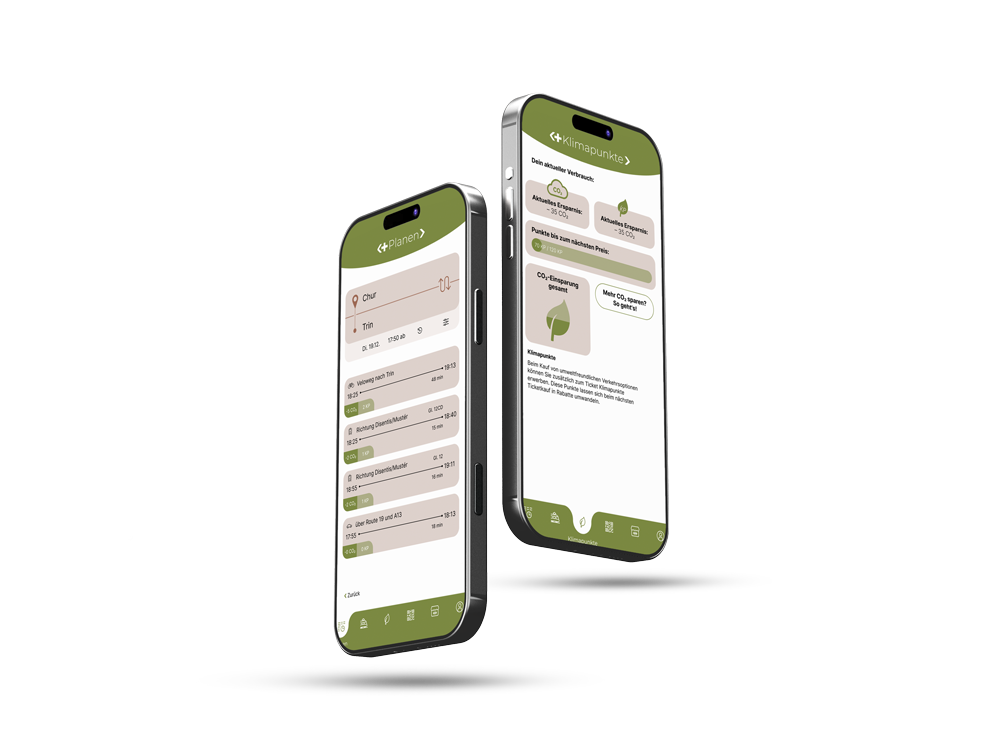
Climate Points visibility
In early versions, climate points were hidden within the user profile, making them difficult to find. Test participants expressed confusion about where to view or redeem their points. In response, a dedicated menu item for climate points was introduced, giving users direct and intuitive access to their rewards.
Points usage during checkout
The initial design combined regular ticket purchases and climate point redemption into a single flow, which caused uncertainty. Users were unsure when and how points were being applied. To resolve this, the checkout process was split into two distinct paths: one for standard purchases and another for transactions using points. This clarified the process and made point usage feel more deliberate and rewarding.
Information clarity
Users wanted to better understand how their actions contributed to sustainability. The revised design includes detailed insights into CO₂ savings, current progress (example: 70 out of 120 points till next reward), and suggestions for earning additional points. These additions enhanced transparency and motivated users to engage more actively with the climate point system.
04 opening animation
To set SBBplus apart from the original SBB app, I designed a custom opening animation featuring a reimagined logo. The animation introduces the «+» symbol combining bike, train, and car drives. It highlights the app’s focus on diverse and sustainable mobility. This quick intro helps users instantly recognize that SBBplus offers a fresh, eco-conscious experience within a familiar design framework.
05 user flow
The user journey follows a fictive person who plans a trip from Chur to Trin, aiming to arrive by 18:40 while maximizing her climate points. From selecting a route and viewing the CO₂ impact to redeeming points at checkout, each step is designed to be clear and efficient. The app displays how many points are earned with each connection and updates the user’s total after ticket purchase. By separating regular ticket purchases from those using points, the flow becomes more transparent and easier to navigate.